Wednesday 16 December 2015

American Abstract Expressionism and Philip Guston

American Abstract Expressionism

There was a group of painters in the 1950s known as the 'New York School' who were part of an art movement called abstract expressionism. Well-known members include Jackson Pollock and Mark Rothko. This group believed art could come from the subconscious and they aimed to make art that was expressive and evoked emotion in the viewer whilst still being abstract. 

Philip Guston

As part of my project I have been looking at the work of Philip Guston. He was a painter and printmaker who was part of the New York school. He used to create large canvases covered with a crux of dramatic colour against a muted background.

Oasis, Philip Guston, 1957

Guston in his studio, 1964

Sketch, Philip Guston, 1954

These images give you a sense of his work and also of the scale. I am particularly interested by his use of different greys: warm, cool, lilac, blue, brown. He layered these over other colours and drew our attention to the throbbing heart of colour in the centre. I am also interested by the way he left a rough edge. Not squaring down his paintings but leaving them in an irregular shape on the white which I think is much more representative of the impulse of emotion. 

Pipilotti Rist

Pipilotti Rist

As part of my photomedia project I have been researching different methods of presenting digital and moving images in order to best convey an idea.

I have been particularly taken by the Swedish artist Pipilotti Rist. She creates experimental videos and finds creative ways to project them. One example I like is 'Himilaya Goldstein's living room'. As an installation artwork she set up an entire living room with different images projected onto different parts, For example, she put images of flowing water onto a dining table set up with silver cups and cutlery. These reflect the images and, to me, are suggestive of lost treasures at sea.


Her work is very cinematic to me, combining amazing light effects with surreal music and moving images.  Her work focuses on the fantastic and surreal. It is intriguing to me and unlike any other work I have seen.

I am excited to pursue this direction in my project. 

Wednesday 9 December 2015

Fine Art Week One Thoughts

Fine Art

The past week we have been looking at lot at 'instinctive' art work. I came into fine art thinking there would be a task set out for us. Instead, our teacher just set put loads of tubs of poster paint, some boards and some paper and said 'just get going whatever you feel like'. I have never had this kind of creative freedom to do as I please, without a structure or an end result in mind. Due to the nature of assessing work in an A Level or GCSE setting, I have always had to have an idea  or a plan before starting.


I created some brightly coloured backgrounds and layered black paint in lines and shapes over it. I then went over this in white paint and oil pastels. Because of the freedom of the exercise, we all produced a variety of unique and expressive pieces. It was really interesting to see everyone's work imbued in their personality. 

I am looking forward to taking an instinctive approach towards my work the next few weeks - enjoying not having a plan!

Saturday 26 September 2015

Looking at Merve Ozaslan

Looking at Merve Ozaslan

As part of my first project of the UAL Art Foundation I have been looking at the little-known Turkish artist Merve Ozaslan. As the theme of the project is 'Land and Water' her collages really caught my eye as an interesting and surreal juxtaposition of the opposing themes.


Her collages are very playful and fun. She uses black and white vintage photographs with colourful images of landscape and water. I like the contrast between the the monochrome and colour - I find it very striking.


I think they pose ideas about imagination and dreams. People who live in the city often dream of moving to the ideal tranquility of the coast and these collages seem to emalgamate these kind of ideas to me. The black and white of the current situation shows its dreariness and unattractiveness; in contrast the beautiful  colour images of the sea show its desirability.


Her collages explore the relationship between humanity and nature. I would be interested in incorporating some of these ideas into my projects and looking at other similar artists.

All the above images are taken from her series Natural Act. 

Ozaslan's information and social networks: https://www.behance.net/merveozaslan 

Thursday 17 September 2015

Encounters Film Festival 2015

Encounters Film Festival 2015

I was lucky enough to attend Encounters which is a short film and animation festival based in Bristol at the Watershed. It is an internationally acclaimed festival but very accessible for the general public, running over four hundred short films over three days.

Short Film 1 - Turning Points

These films were all concerned with children on the cusp of adulthood making decisions at the cornerstones of their lives. I really enjoyed these thoughtful and well set out films. One notable film was 'Tisina Mujo' meaning 'Quiet Mujo' by the Portugese director Ursula Meier. When a young boy, Mujo, kicks his team's football into a graveyard during a match, he finds something else. He meets a woman who we grow to learn is visiting his dead brother and sister-in-law. They grow acquainted and we learn that Mujo has also been grieved with death at the loss of his mother. A comical moment was when she chided him for smoking a cigarette and confiscated it not before taking a drag herself and passing it between them. This was juxtaposed by their poignant goodbye hug: he a brother figure to her and her a mother figure to him.


Another film I really enjoyed was 'Blood Below the Skin' by Jennifer Reader. t follows the lives of three girls over the course of a week who are all in different social circles but all know each other. One of them is nursing her depressed mother after the disappearance of her father and the other two are falling in love, all while discovering truths about society, boys and growing up. I liked that it was set in an American high school but they all wore identical school uniforms making it a pseudo-brutish private school. I think this was to  highlight their age and apparent innocence in contrast to their behaviour outside of school. I liked the witty dialogue and the way you could hear the girls' thoughts making it very honest and at times painful but still funny. It was at times pretty bizarre, managing to incorporate punk music and classical choir music into but it worked because it reflected the girls' developing taste in music. I thought this was a punchy and powerful rendition of teenage girlhood.


Animation 5 - Rise and Fall

Having never really had any experience in animation I found this experience really interesting and eye-opening. I particularly enjoyed 'The Master' by Riho Unt: this animation followed the story of two pets after being neglected in their home by their master. I loved the music, it seemed to be set in an old-fashioned European apartment and the music reflected this along with the changeable emotions of the animals. I thought the modelling of the animals and the setting was intricate and really set the scene. Afterwards on researching I realised that Unt is an interior designer by trade which might explain this. I also liked the conveyance of the animals' expressions; for example in the picture you can see the whites of his eyes showing the direction of his gaze and surprise. I think this was my favourite film of the festival as I thought it was a poignant remark about shifts in power and what isolation can drive you to.


All in all, I thoroughly enjoyed my time at the festival. I learnt a lot about what works well in short films in terms of plot and dialogue and - especially in regards to animation - how creative people can be with materials. I will be sure to visit next year!

Tuesday 8 September 2015

A Response to the Van Gogh Museum in Amsterdam


A Response to the 'Van Gogh Museum' in Amsterdam


Van Gogh’s work is familiar to almost everyone nowadays. Paintings like ‘Sunflowers’ and ‘Chair’ have made his use of yellow and blue renowned. The backstory of his life is also well-known: the tortured soul whose genius was never known until after his death. When I visited the museum in Amsterdam dedicated to his life, I felt I saw a different side to his work.
I found it interesting that Van Gogh loved and idealised country life. He used to paint the peasants who lived near him in Nuenen. In his painting ‘Head of a Woman’ (oil on canvas, April 1885) you can see he has exaggerated the prominent features of the face, such as her upper lip and nose, in a caricature effect. Although this isn’t accurate, it is more expressive and characteristic. The same goes for his use of colour and brush stroke. The fashion at the time leaned towards gaudier colours but you can see the wide range of muted colours that Van Gogh has produced from his palette to convey the highlights and lowlights in the face. I like how Van Gogh was not interested in capturing conventional beauty but the rugged beauty of the peasants.


I learnt that Van Gogh was drawn to Japanese artwork. In his painting ‘Flowering Plum Orchard (after Hiroshige)’ (oil on canvas, 1887) he copied a print by Utugawa Hiroshige. You can see that he developed it himself however, using lilac for the trees in the background and intensifying the colours. He also added in a pseudo-Japanese border with Japanese characters which I think was very creative and made the piece stand 
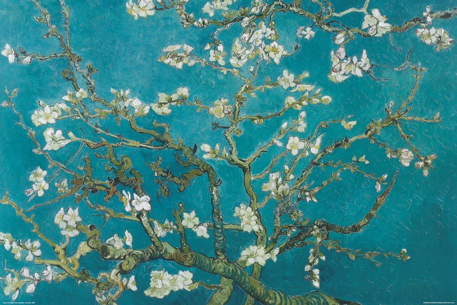
out to me.  You can see the influence of Japan in his other works too, for example one of my favourite paintings was ‘Almond Blossom’ (oil on canvas, 1890). I think you can see his Japanese influences through the subject matter and the delicate colour scheme. I like the way he has used bold teal brush strokes to add to the detail of the branches and the way the vibrant cyan sky contrasts with the pastel petals.


Van Gogh had ten years as an artist as he only began painting when he was thirty in 1879. In the museum they displayed some of his letters in which he wrote about the pressure ‘to make up for lost time’. The process he used to improve as an artist interested me. He used every painting as a stepping stone; a way of improving and moving forward. He also used to experiment with finding light and dark shades without using any white paint. I was impressed that he fitted so much learning into such a short space of time.

I saw many things that I could have written about. I was intrigued by his self portraits and the paintings that he did while he lived in an asylum at Saint-Rémy-de-Provence. I think by being immersed in his work for a few hours I was allowed to see the connections between his different movements and to get into his mindset. In his last few months of life his turnout of artwork was so prolific – I believe he was doing a painting a day –  and his period of work was so short that somehow a whistle-stop tour of his whole life seemed appropriate. My overwhelming thought at the end of this experience is that I am impressed: by the range of themes, colours and experimentation in his work, that he was brave enough to start late in his life and that he worked so hard. It proves to me that talent and genius does come alongside hard work. Perhaps if I had been to an exhibition of Van Gogh’s work rather than a whole museum I would have felt differently as I would only have seen his best pieces and not all the thinking that went behind them.